Kitchen Refresh: Before, After, and All the Deets
Okay—it’s been a long time coming, but finally, I am here to share the deets about our kitchen remodel!
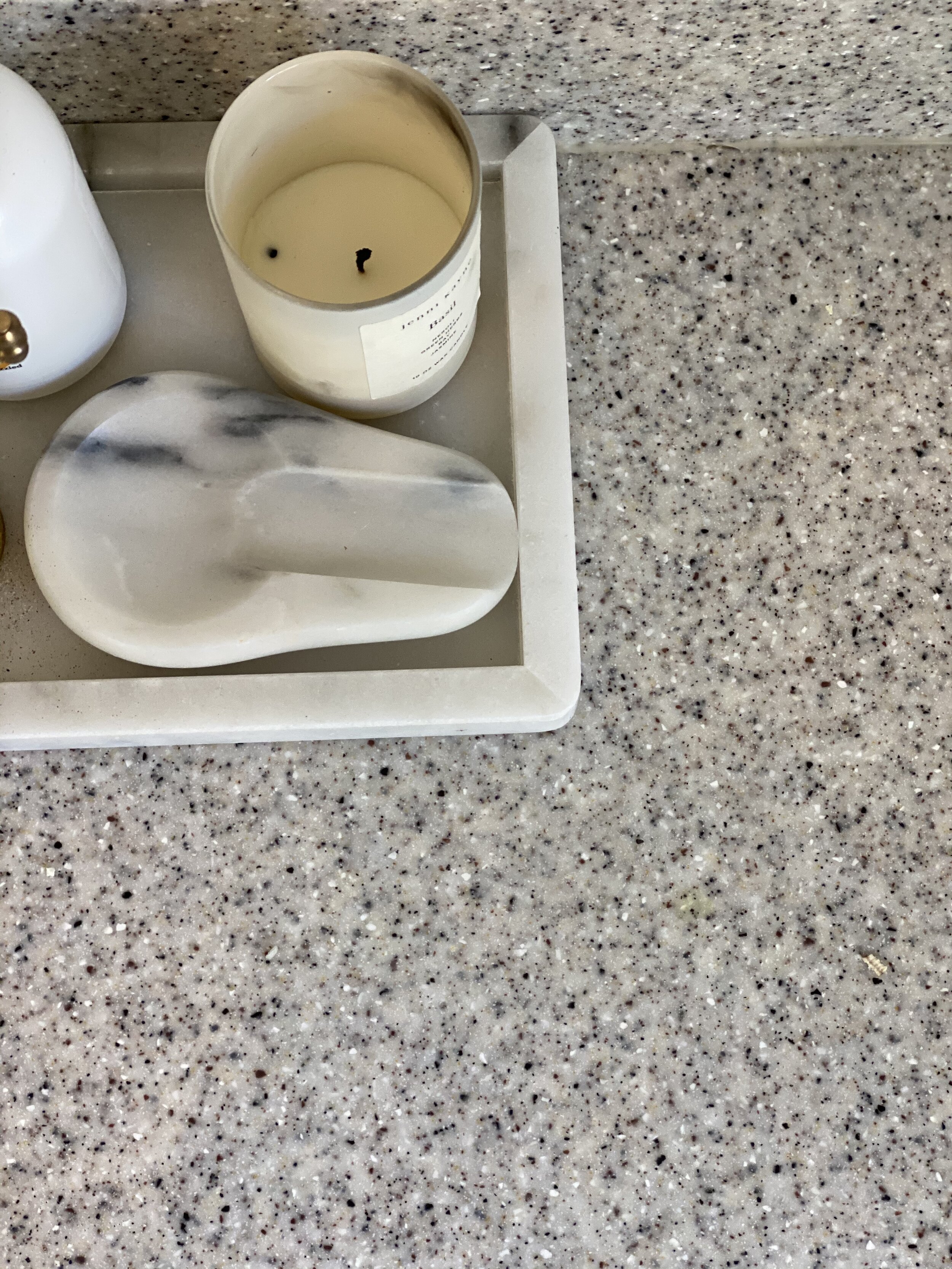
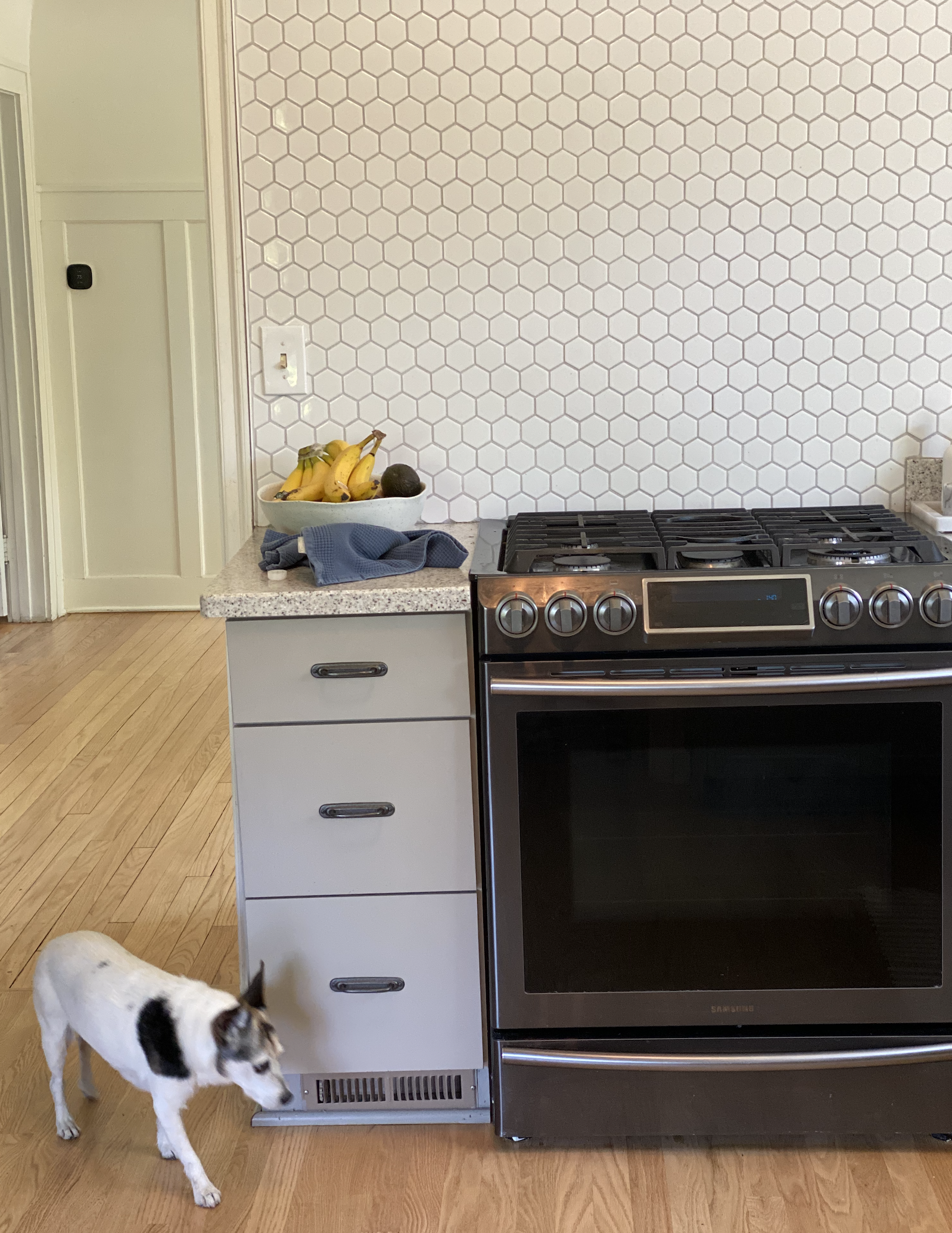
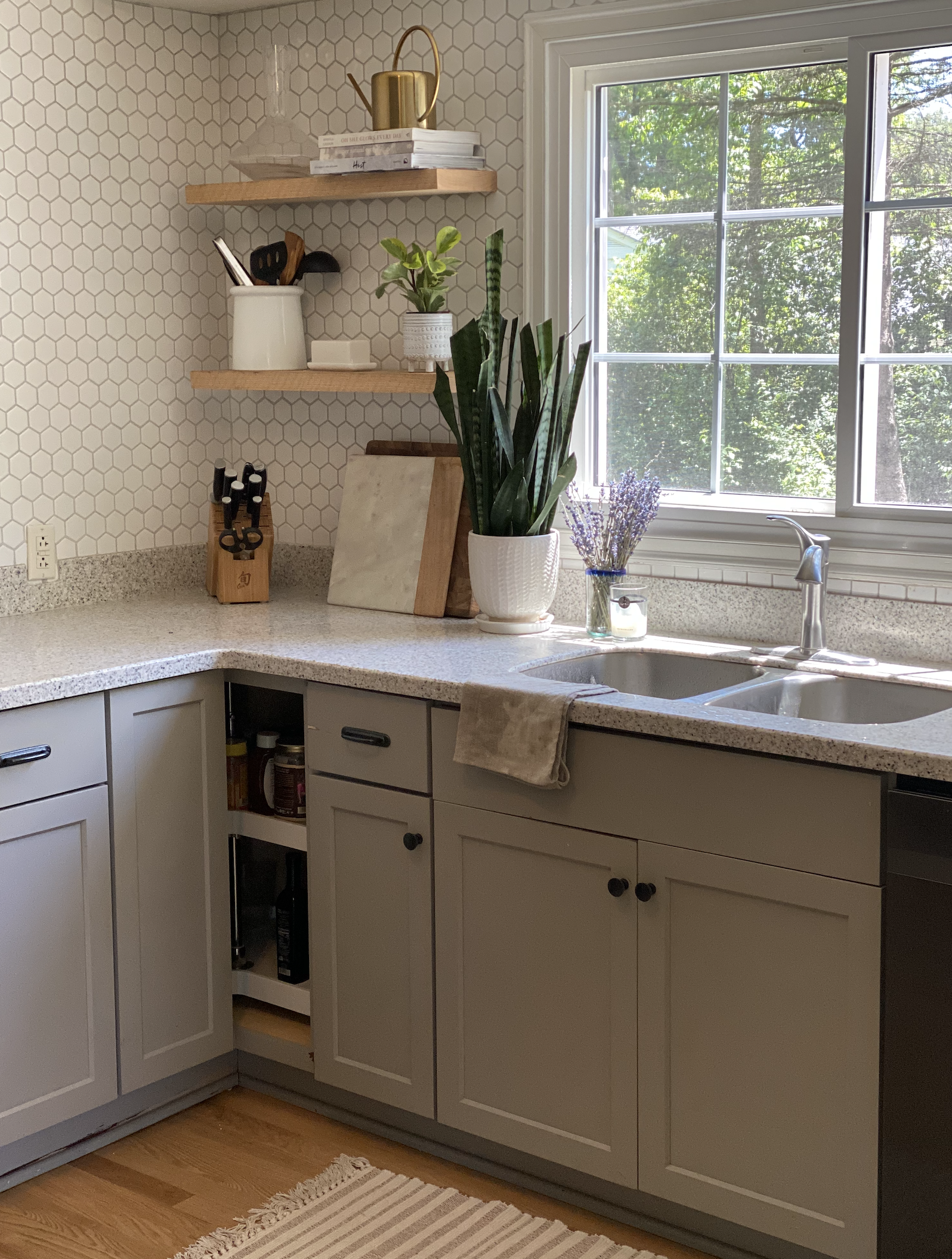
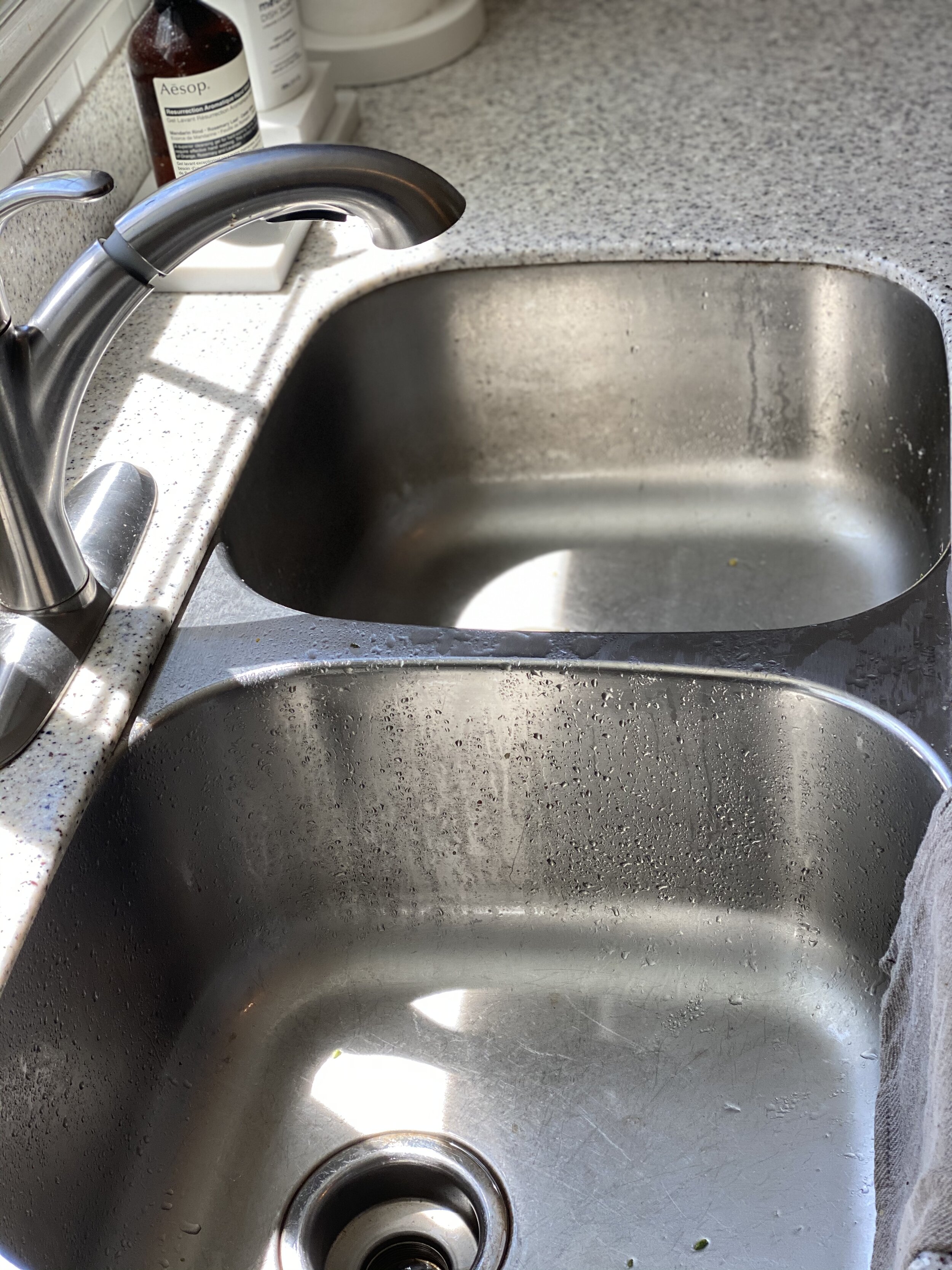
When we moved into our home, the color story was sort of deep and moody: muted greens, walnut browns, dark charcoals. With all the natural light and plant life exposed from the outdoors, I really wanted to add an airy, organic vibe and create more lightness in our space.
We painted our entire home Swiss Coffee by Benjamin Moore—trim and walls included—which is a slightly warm white. Also, we refinished the wood floors to be a natural oak, a lighter more modern hue in contrast to what was a red oak that you’ll often see in old homes (our home was built in 1926).
Overall, our home began to feel more like us, but when you walked into our kitchen, it still felt—I don’t know—a little weighted down.
Vision and goal-setting
As someone who spends so much time in the kitchen, I felt something needed to be done to create a brighter vibration. In an ideal world, I’d like to sophisticate our playful kitchen by ripping out the hexagon backsplash, installing light marble slabs up to the ceiling, maybe even take out a wall and open up the space…
… but as my husband reminded me, this isn't our “forever home.” We want to build one day, and so it didn’t make sense to take out a mortgage on something we see as temporary. So, in general, my goals when planning our remodel were: (1) to create a flow between the kitchen and the rest of the home, but (2) to not spend an arm and a leg and while doing it.
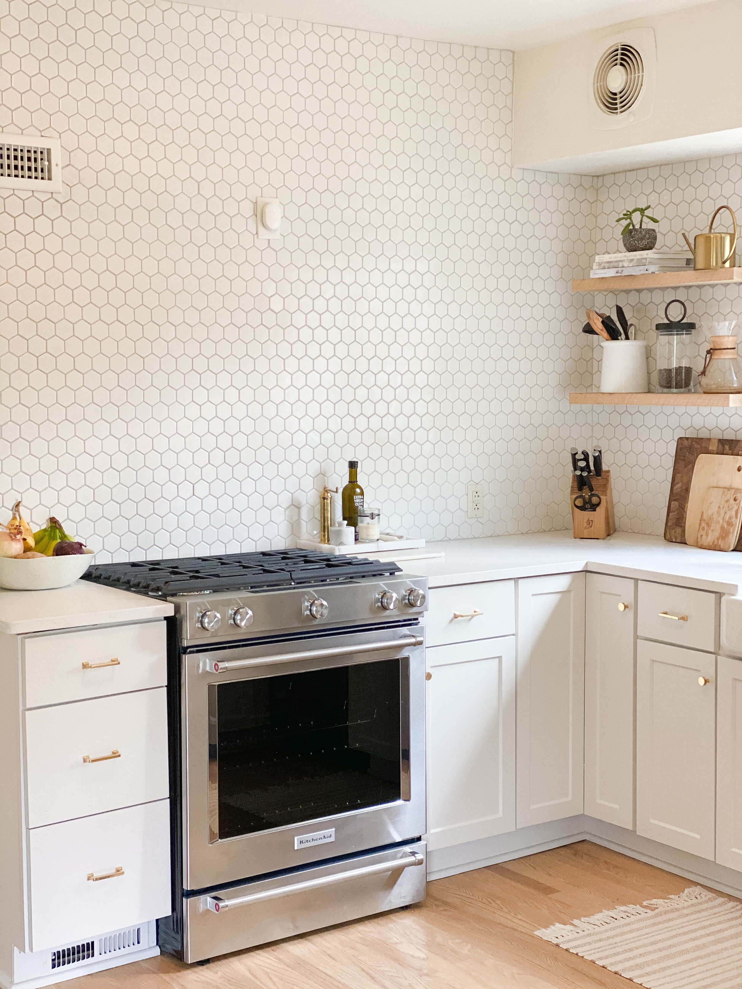
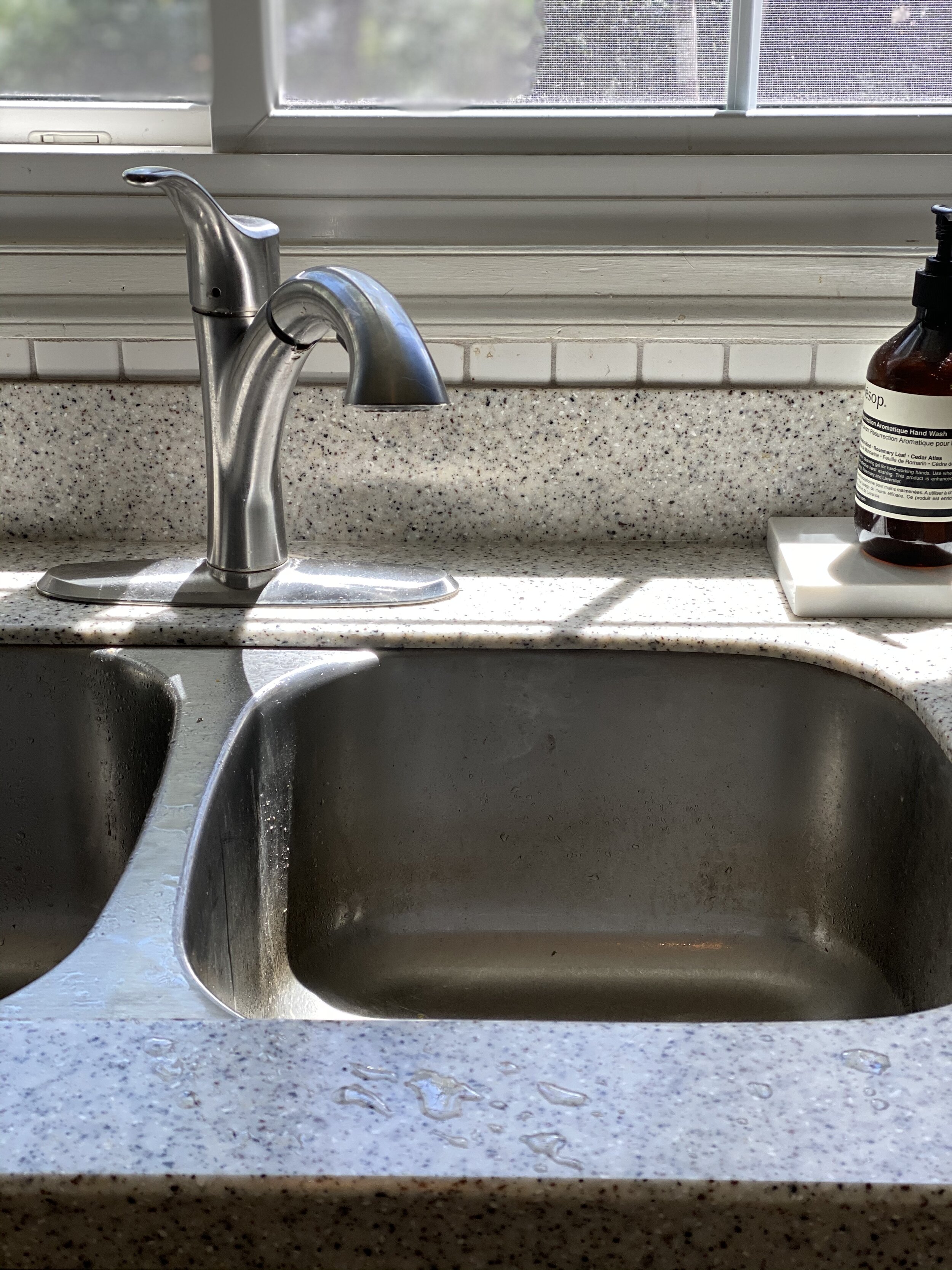
In order to lighten up the space, I knew we had to paint the cabinetry to make it brighter, install lighter countertops, and replace the charcoal appliances and hardware. I also saw an opportunity to open up the sink area, which to me feels like the focal point of the kitchen.
Priorities and budget
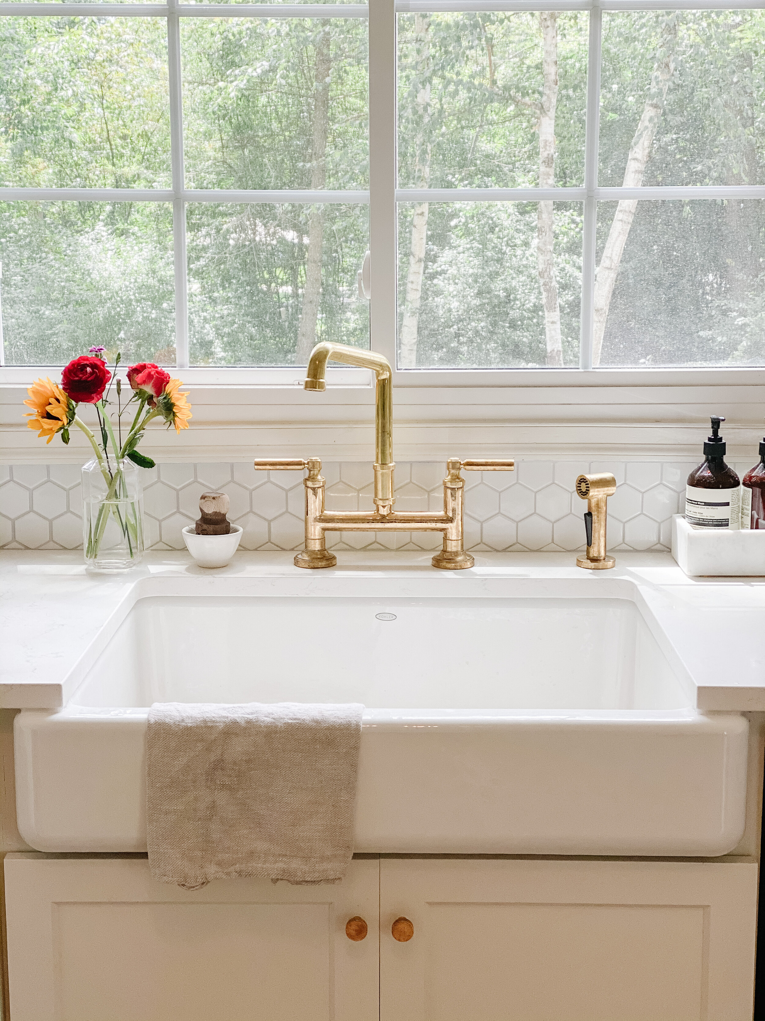
When working within financial limits, I start by determining my top priority—and then I work around that. I am willing to spend more money on something that is very important to me, and cut back costs on the less important things. For me, that very important thing was an unlacqured brass faucet (to me, it’s art!) and a big farmhouse sink. The less important things were removing the hexagon backsplash and installing marble, so we kept the hexagon tiling and went with a great matte quartz for the countertops.
Countertops
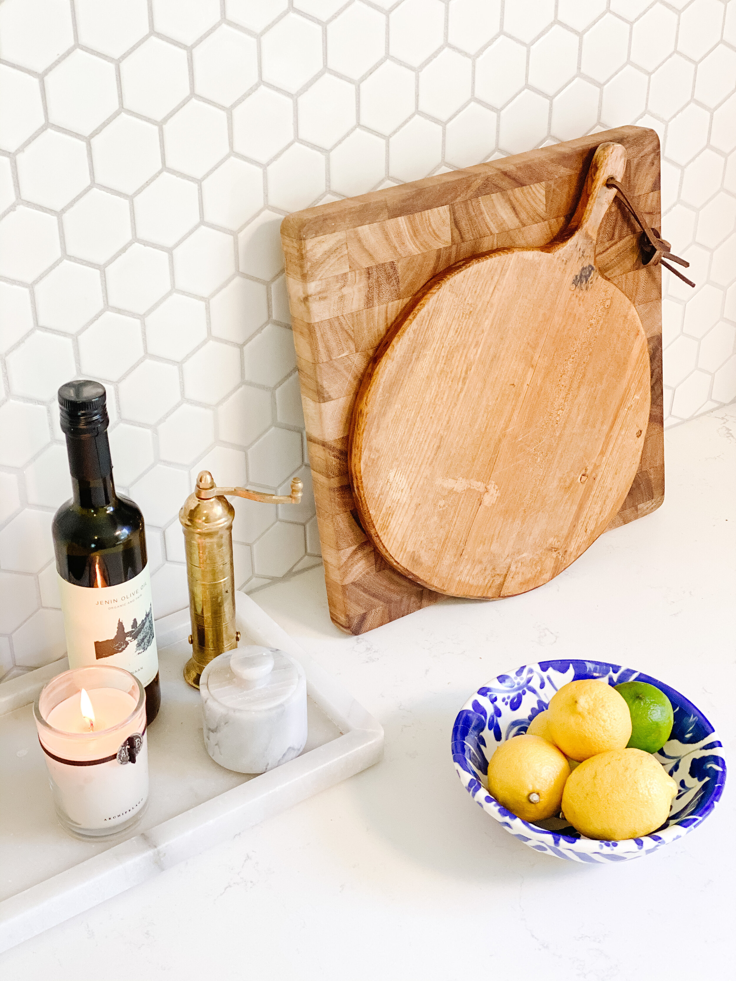
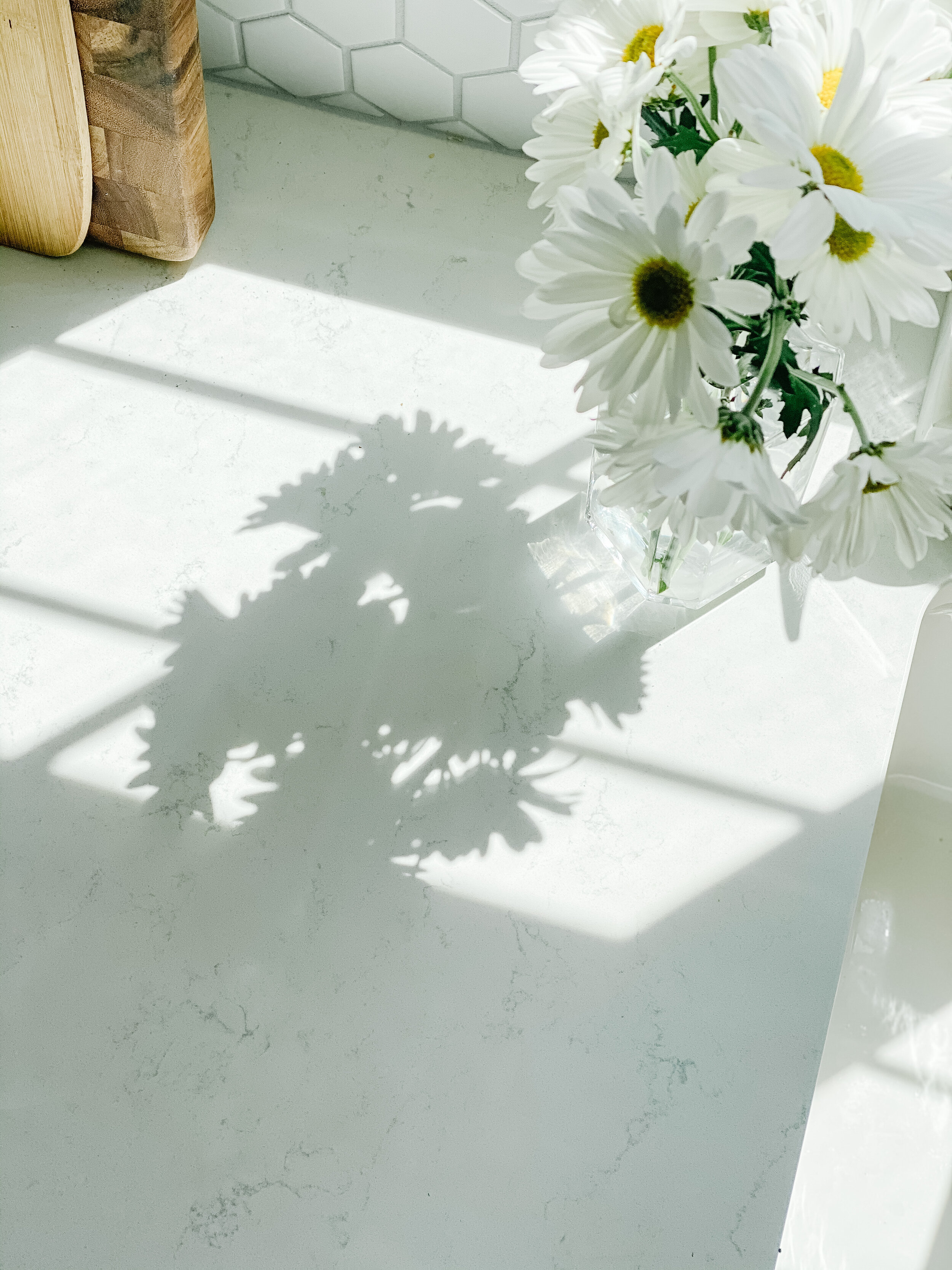
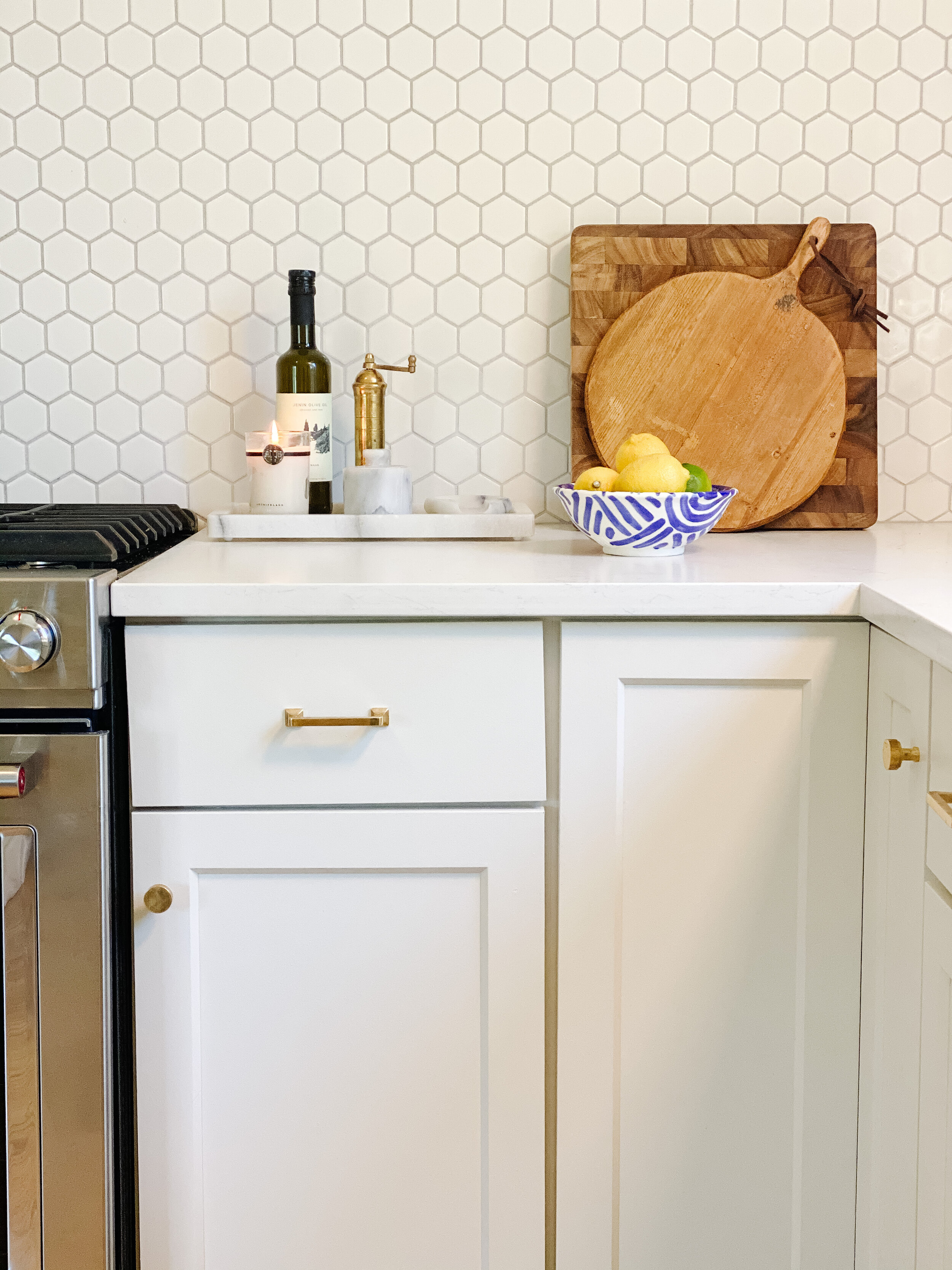
One way to brighten up our space was to remove the busy/dark countertops. After a ton of research, I chose the Calacatta Vicenza Matte quartz, which resembles honed (i.e., matte-looking) marble. Most quartz has a shiny/polished finish, but there are more options coming out on the market with a matte finish. I preferred a matte finish for this project because it would contrast against our white polished backsplash for an added dynamic. Also, I love the look of honed marble, so this was a good pick.
Some important things to know about quartz versus marble: (1) marble is a natural stone, but is a more porous and will easily stain and scratch, (2) quartz is a manmade stone, but it is more durable and won’t stain/scratch as easily, and (3) not all marble is more expensive than quartz. Actually, I found many quartz that were comparable or even higher in price to marble. Of course, there are a gazillion options to consider outside of marble and quartz (quartzite, granite, concrete, to name a few) so there’s a lot to study and consider.
Paint and Hardware
In order to create that airy “flow” factor, I knew I needed to brighten up the paint on the cabinets. However, I didn’t want to go stark white like the rest of our home. I wanted the slightest hue to create dimension within the cohesion of the overall home. I went between three paint colors, but ultimately, went with Benjamin Moore’s Classic Gray (oC-23), which is part of the off-white collection but really is the faintest gray without being too cool.
To add warmth against the gray paint, I chose unlacquered brass hardware. Unlacquered brass, unlike polished brass, will spot and wear with use (AKA “patina”) to give it a more rustic look. I tend to prefer the look of a worn brass, but that is just my preference. I thought it also worked well with our early 1900’s farmhouse construction.
Like countertops, there are a gazillion types of hardware to choose from—not just in material, but also in shapes and sizes. I went with these classic square pulls and these circular flat knobs to add a simple modern touch.
Sink and Faucet
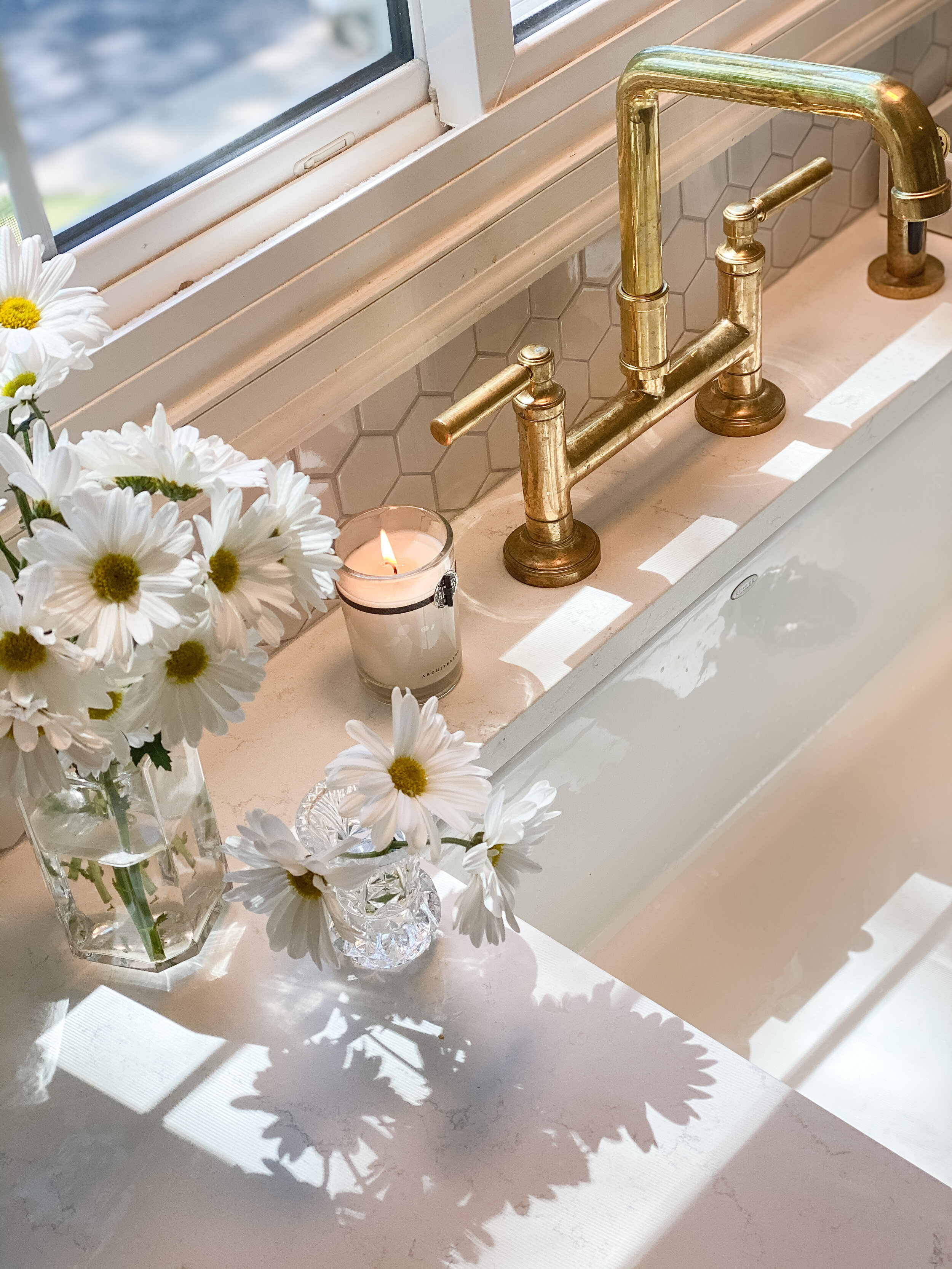
Our kitchen is somewhat small—there is no grand island or range hood as a focal point—so I wanted to make the sink and faucet the center of attention. As mentioned, I knew I wanted an unlacquered brass faucet, but I wasn’t sure which shape. After much contemplation, I chose to go with the Quincy bridge faucet and side sprayer by Kallista. It has a slight square shape, unlike the traditional goose-neck faucets, to give a slight modern structure to the space. This was a pretty penny, but totally worth it for me—it’s art!
For the sink, we went with a single-bowl farmhouse sink by Kohler. It’s a joy to do dishes in (even Michael does the dishes) and it’s large enough to be our dog’s new bathtub.
The large white sink, along with the faucet, creates a new focal point for the kitchen.
Appliances
Previously, we had dark gray Samsung appliances, but to lighten up (and refresh) the space, we replaced them with KitchenAid stainless steel appliances. These appliances look similar to the classic Viking appliances, but at a fraction of the cost (again, not our forever home) so this worked out really well.
Closing Thoughts
Our kitchen certainly works well with the rest of the home—the one goal I definitely wanted to accomplish! In retrospect, I might go real marble with slight veins (on the less expensive end) because this quartz is quite bright and truly patinas in the same way real marble would (also, there’s nothing like the real stone, right?). Marble will go in the future forever home. Overall, this remodel was a perfect refresh for our farmhouse, and I’m really happy with how the project turned out.


